Brand Identities & Assets
With a focus on fashion, lifestyle and culture, Matthias develops concept-driven brand identities that lay the foundation for a strong and holistic brand personality, as well as highly flexible brand assets that seamlessly integrate into existing brand worlds.
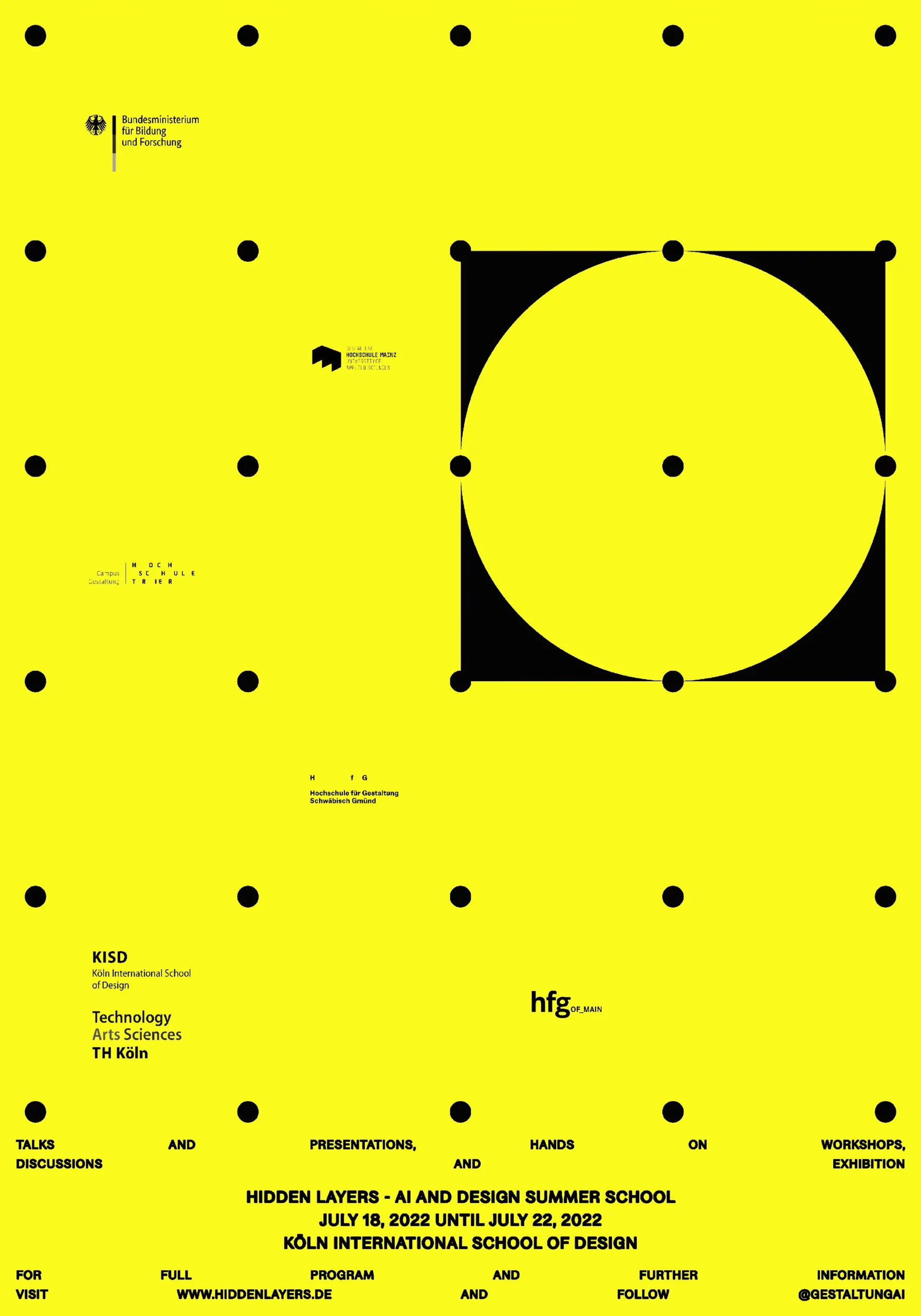
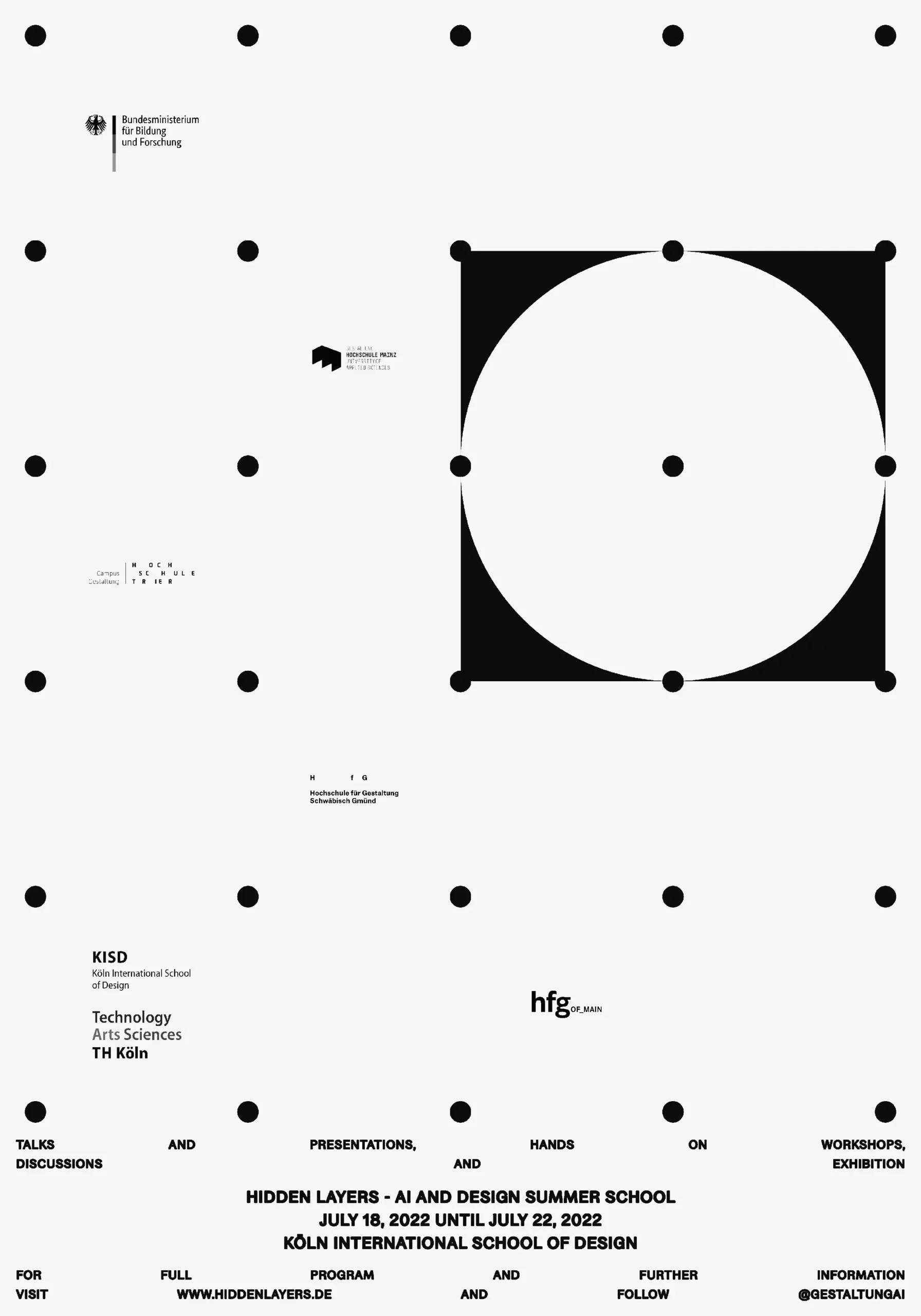
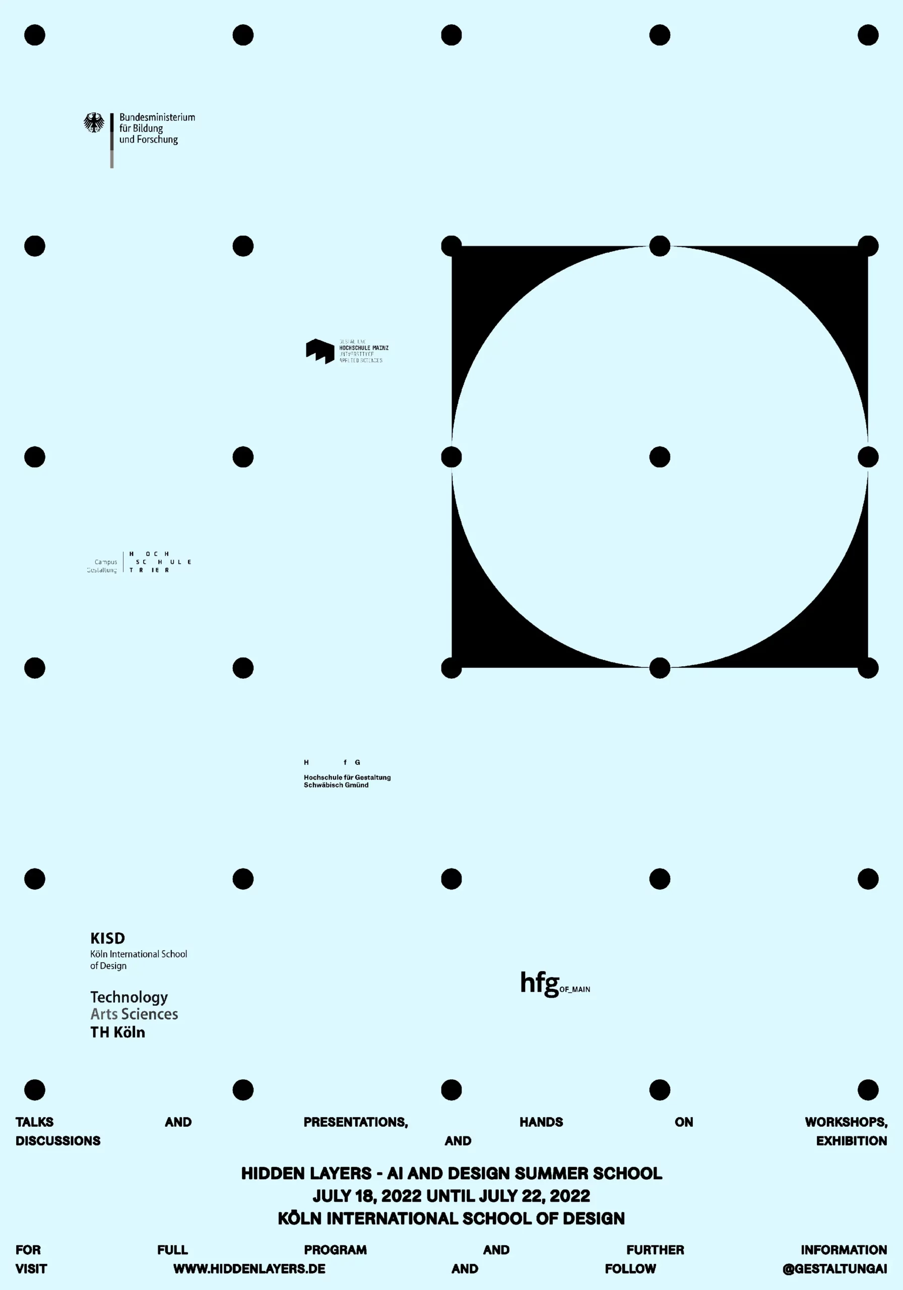
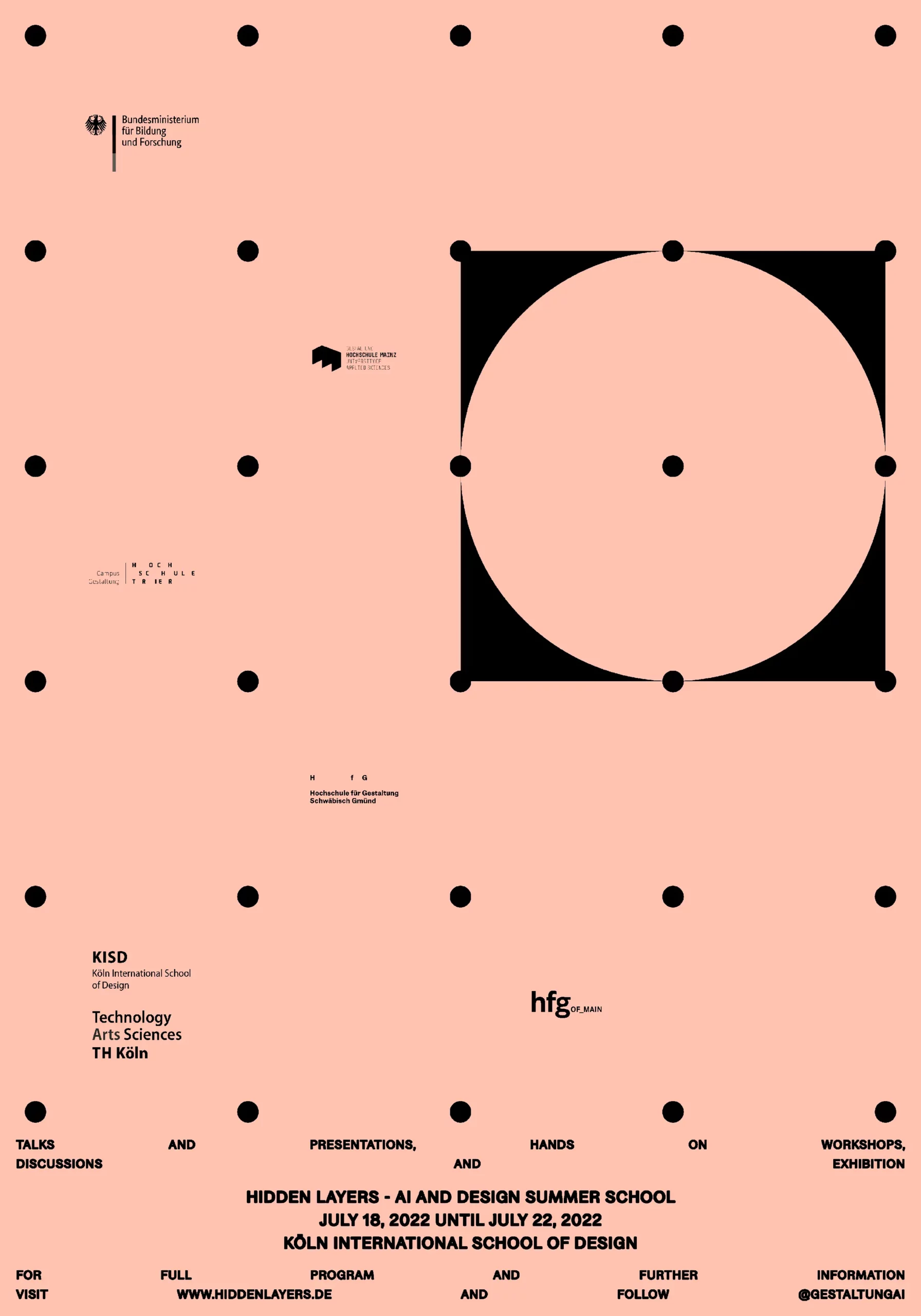
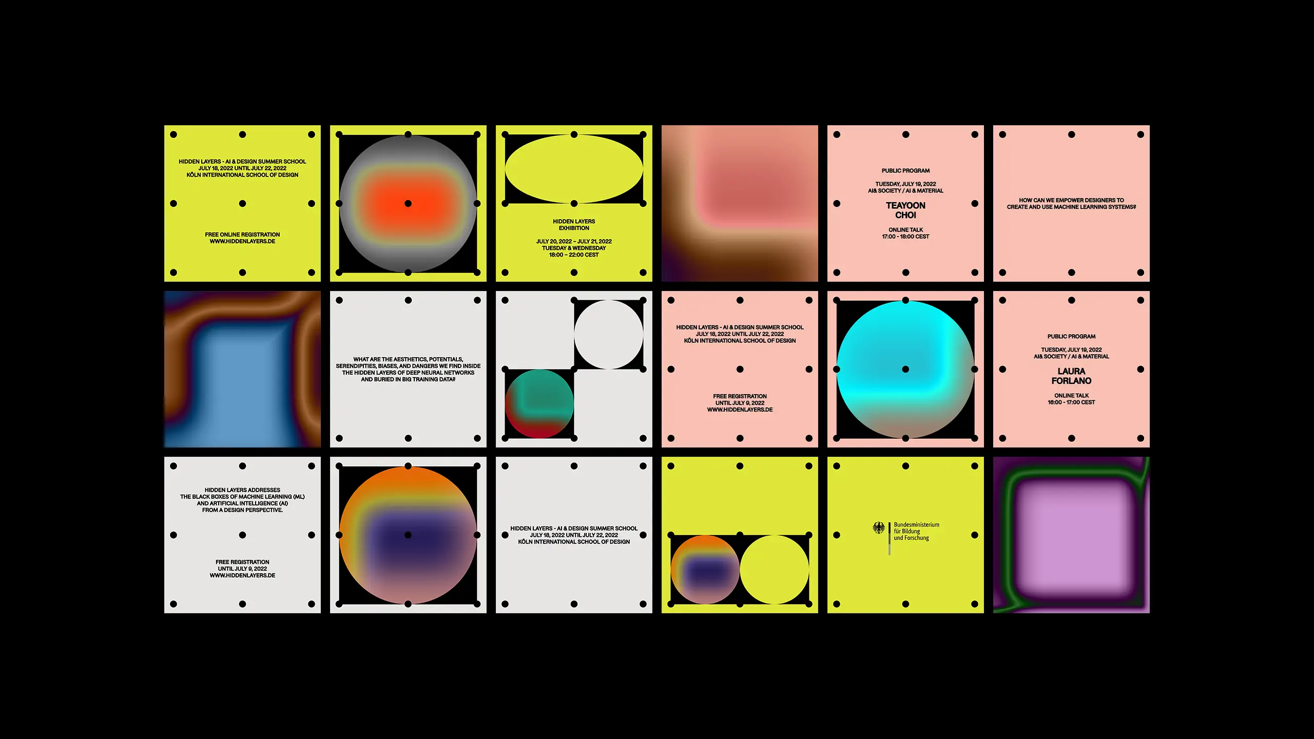
Visual Identity for Hidden Layers Summer School
Addressing the often overlooked human labor involved in the development and operation of artificial intelligence systems, while drawing inspiration from "punch cards", a foundational technology in the early days of computing.
With and for the KITeGG Research Project, 2022
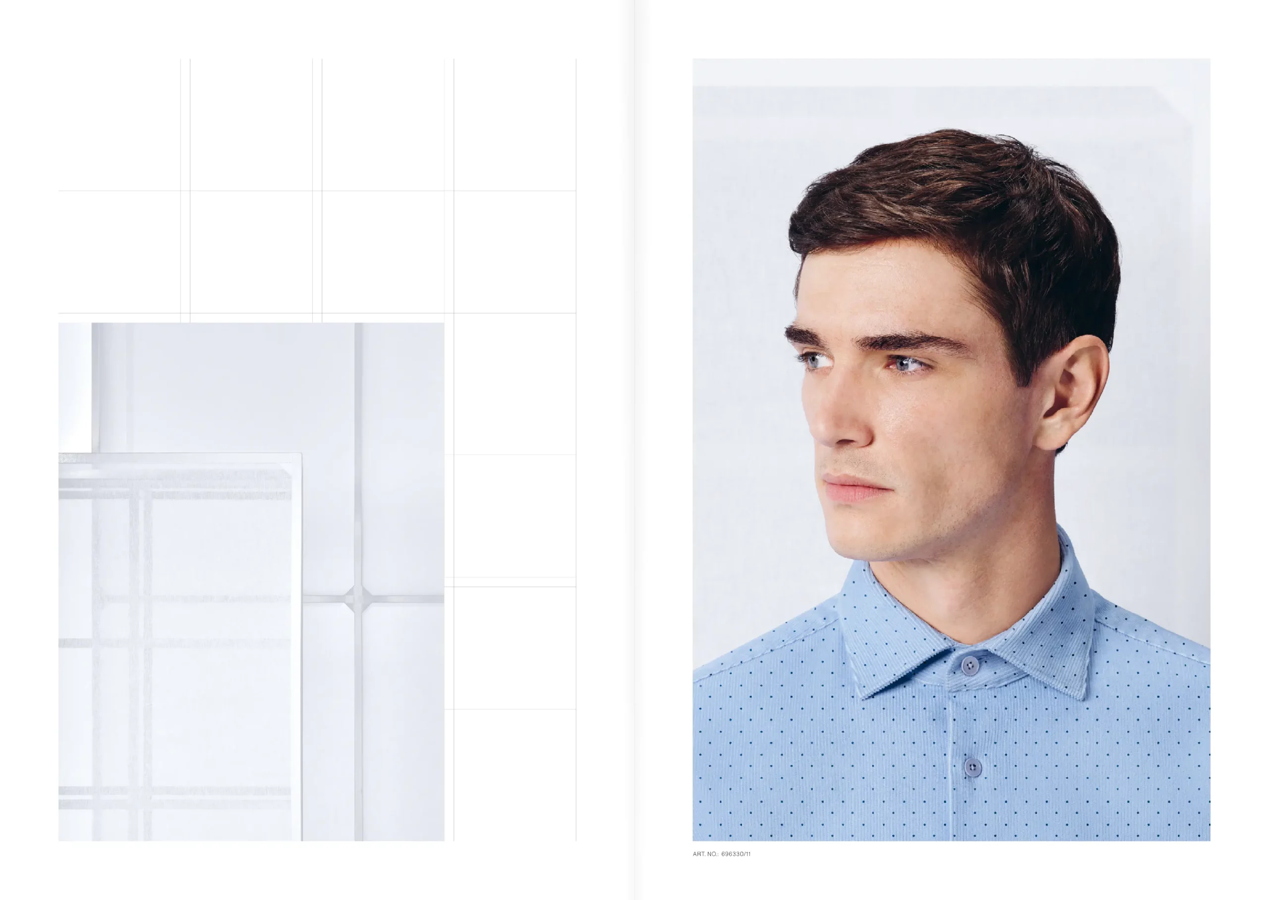
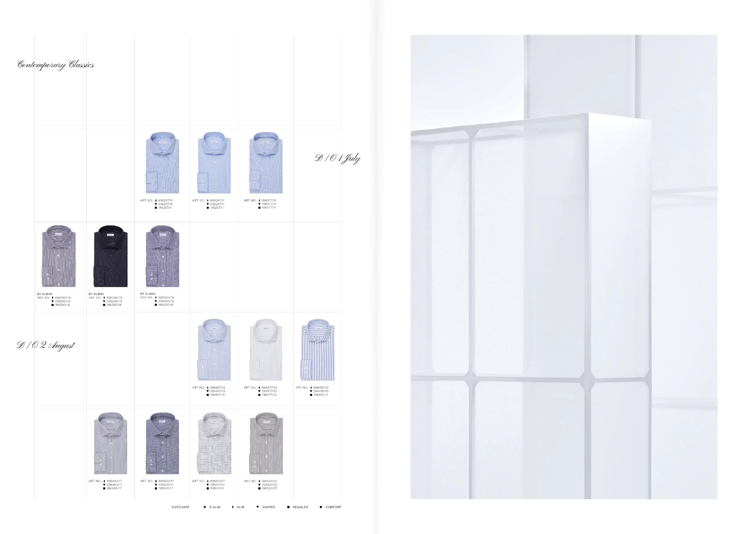
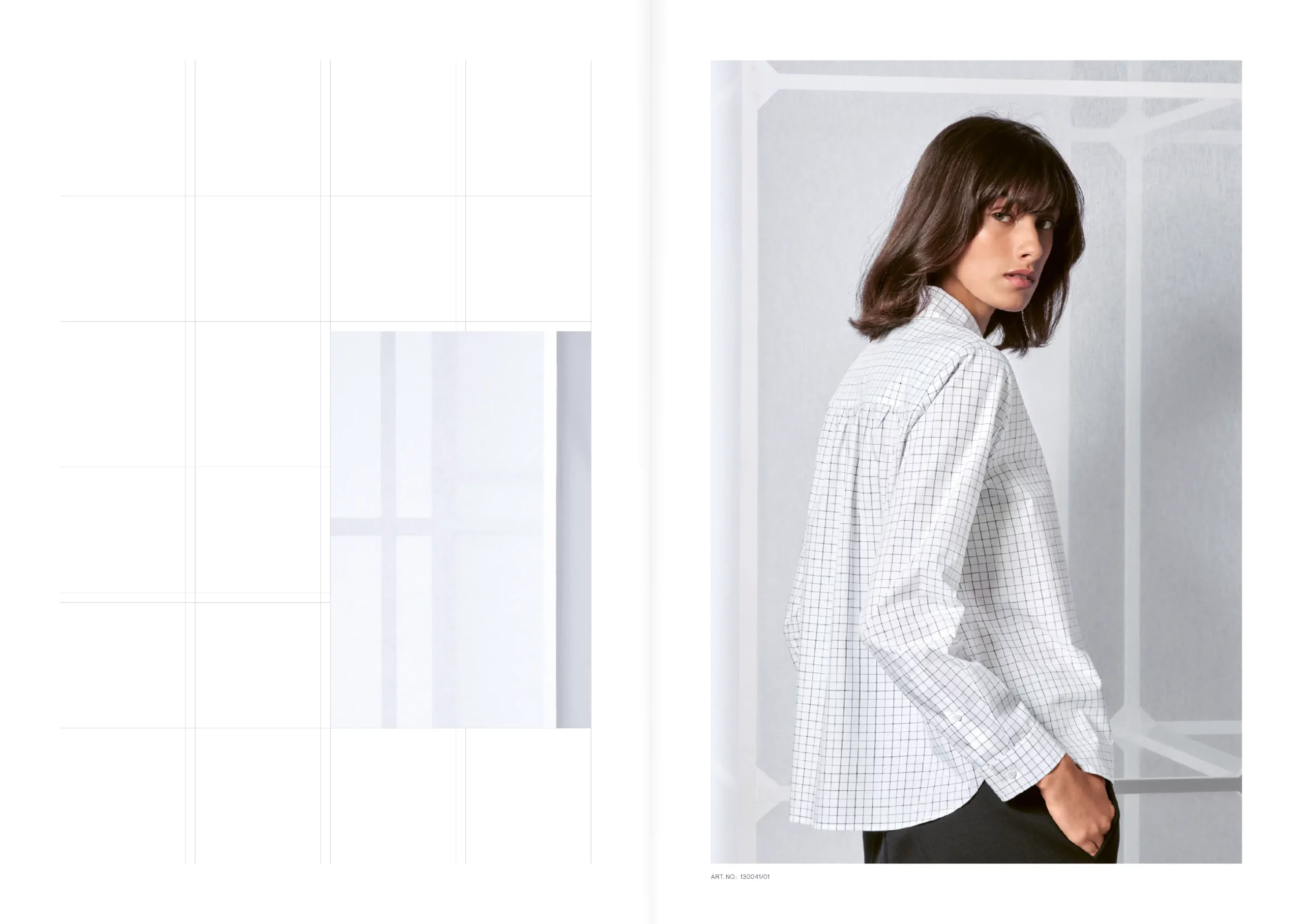
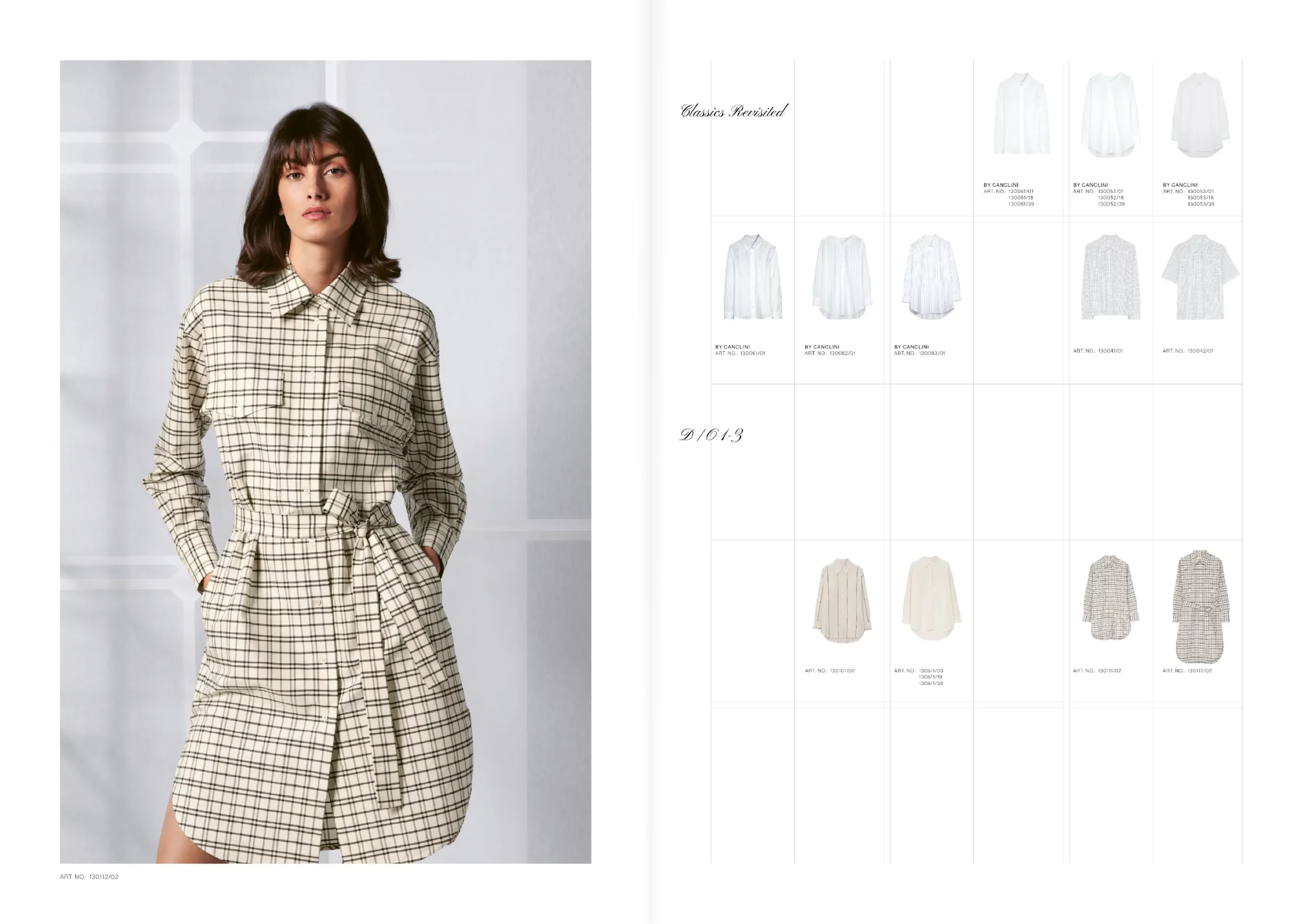
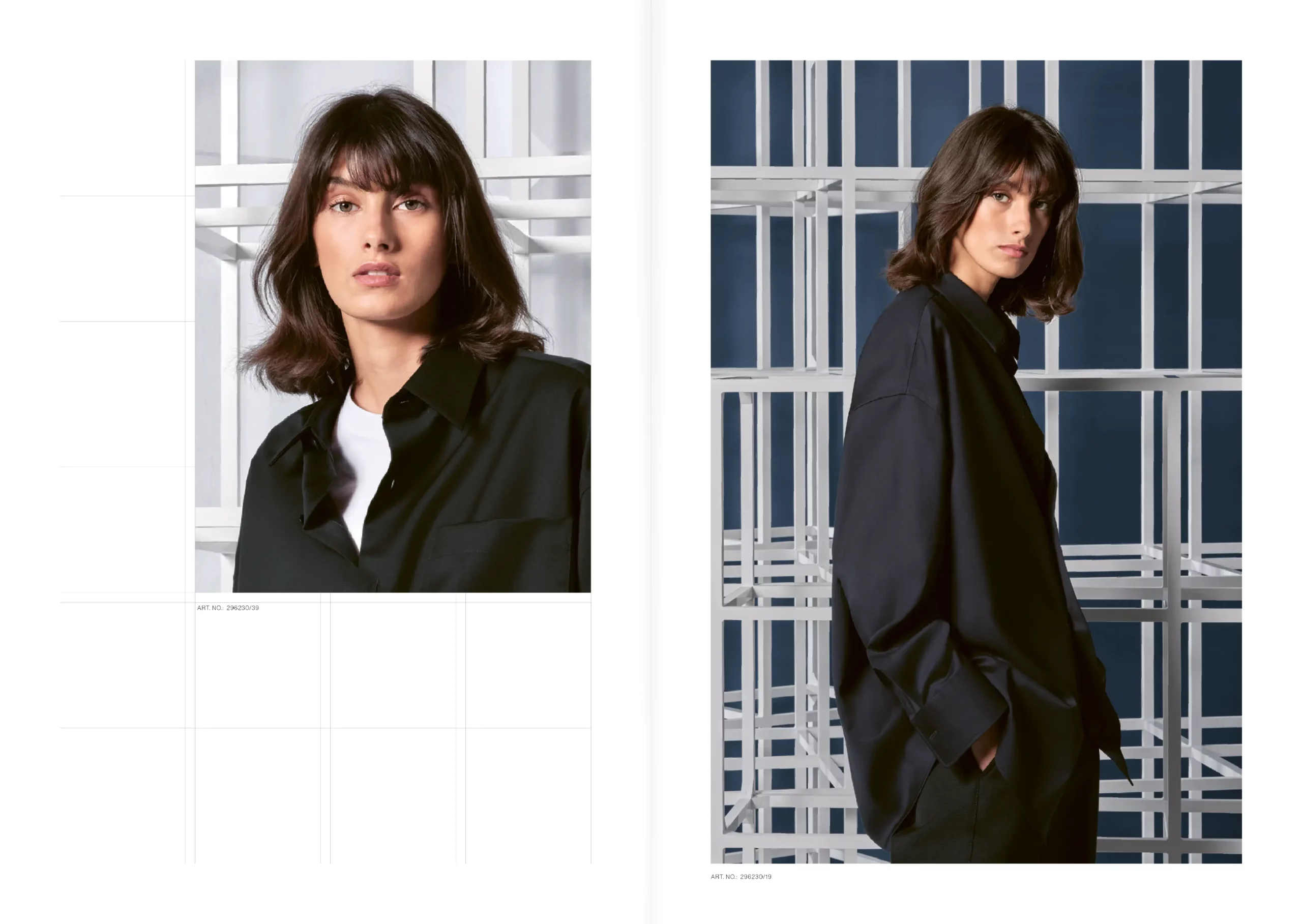
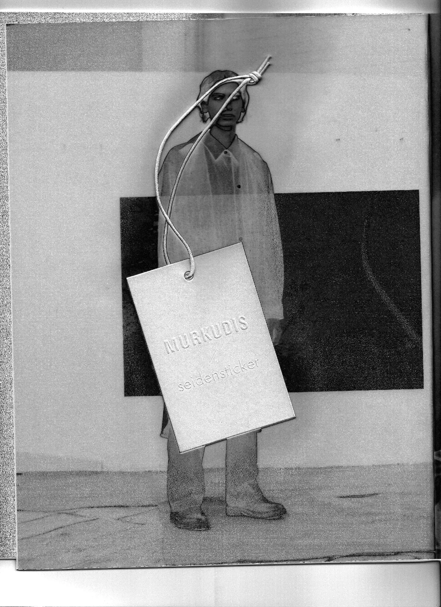
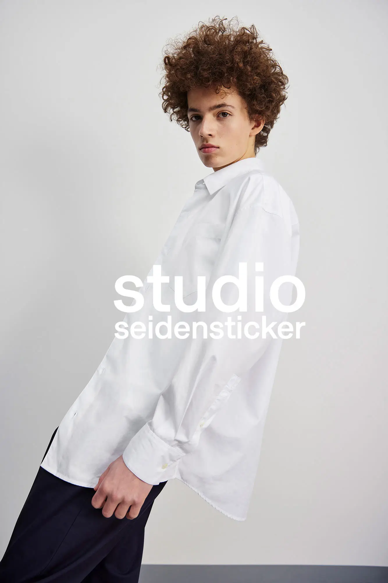
360° Marketing & Art Direction for Seidensticker
Development and supervision of the brand’s visual communication (imagery, graphics, typography) for the seasons Autumn/Winter 2019 to Spring/Summer 2021, including 360 campaign visuals for retail and e-commerce, strategic development and creation of weekly newsletters, advertisements, product shoots, set design, print products and screen design. Furthermore, coordination of the interdisciplinary team of copywriters, illustrators, photographers and designers.
With and for Bel Epok 2019-2021
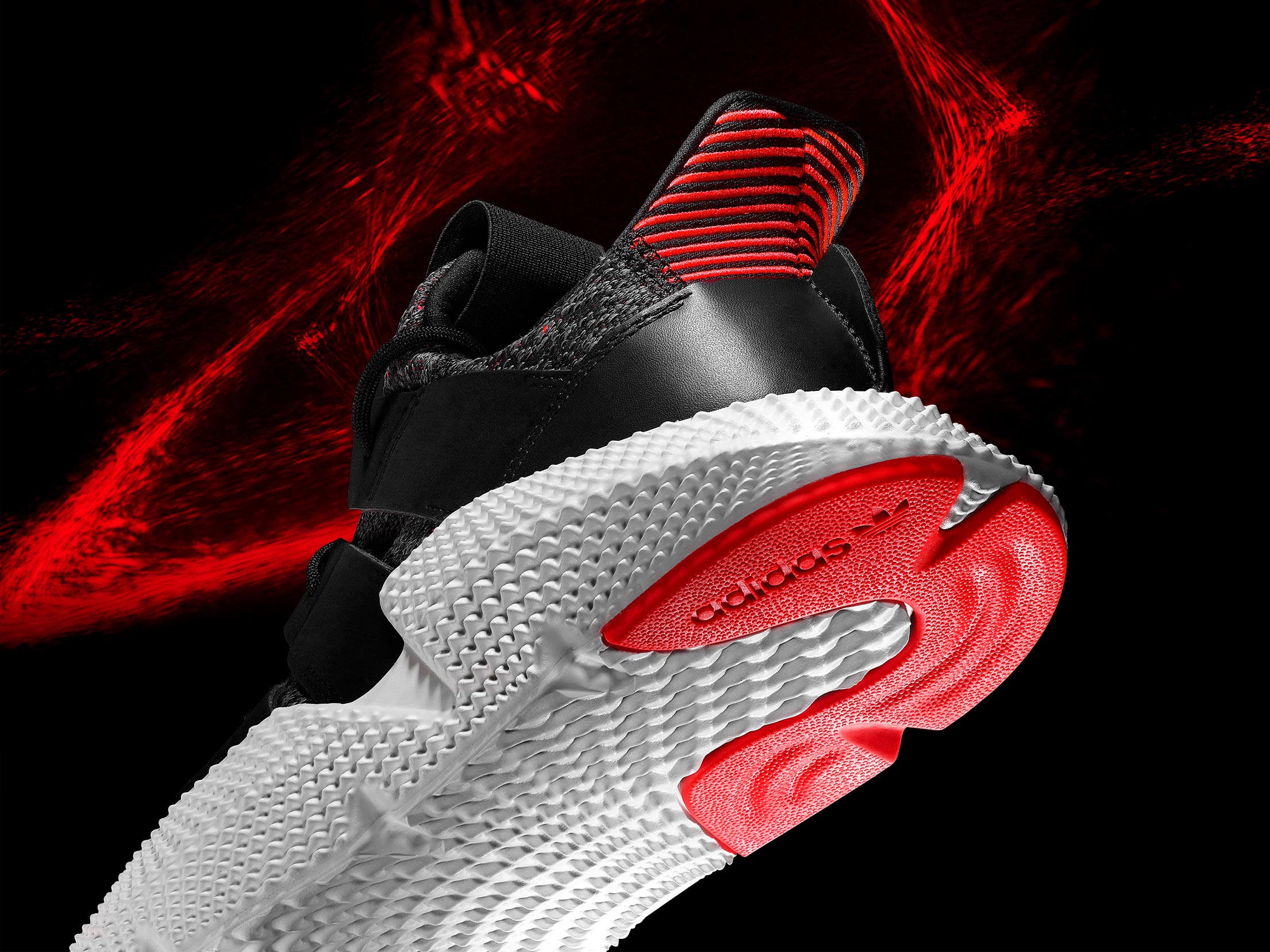
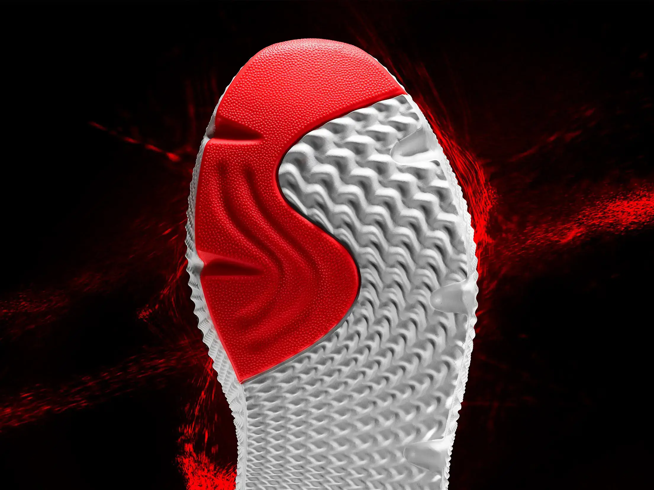
Editorial Content for adidas
Editorial content for the launch of the adidas Prophere, highlighting its bold design and exaggerated sole through a dark scene surrounded by powerful lighting effects..
Visual Concept, 2017
Creative Direction: Holger von Krosigk
Photography: Manuel Mittelpunkt
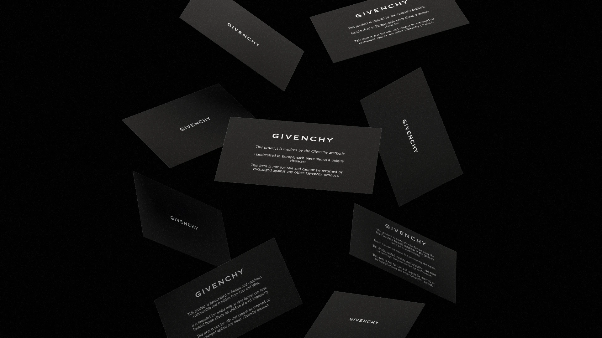
Supplement Cards for Givenchy
Accompanying information cards for the French luxury house.
With and for Bel Epok, 2021
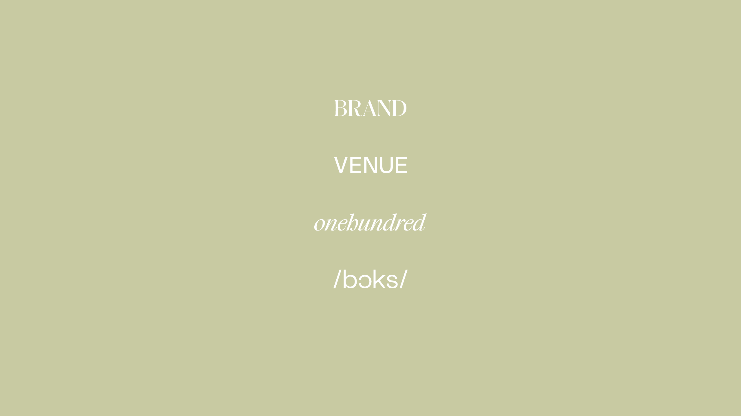
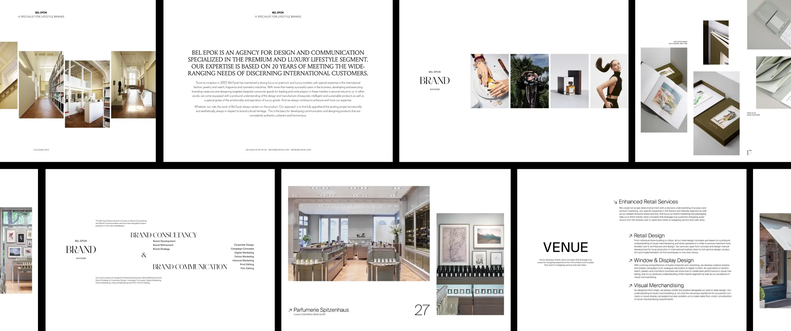
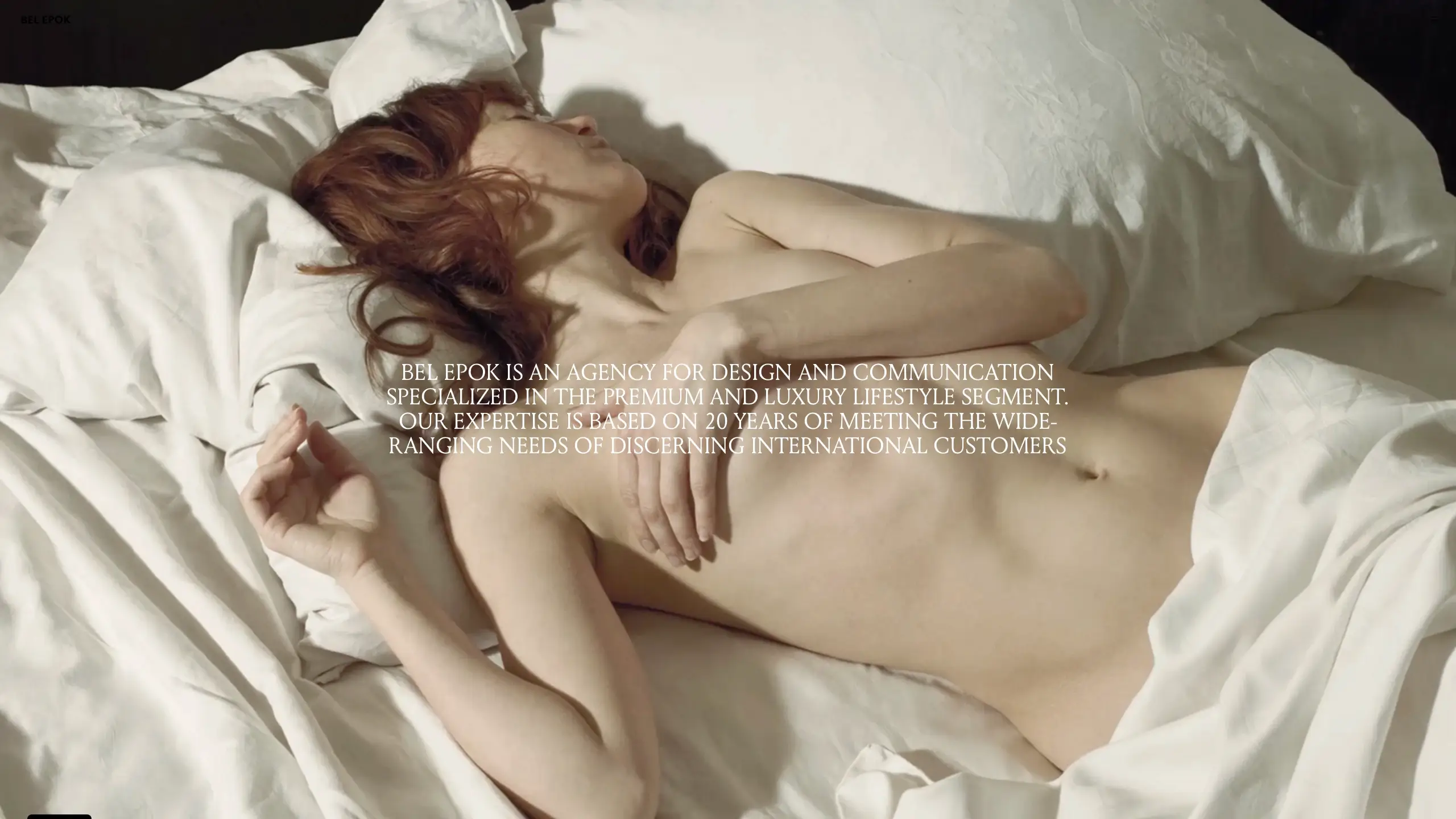
Brand Refinement for Bel Epok
Refinement of the visual communication and strategic positioning of the Bel Epok agency in close collaboration with the management. Responsible for the redesign of the visual identity, including external communication assets (presentation templates, logotypes, stationery and printed materials, etc.), the conception of the social media strategy, as well as the redesign and development of the agency’s website.
With and for Bel Epok, 2020 - 2021
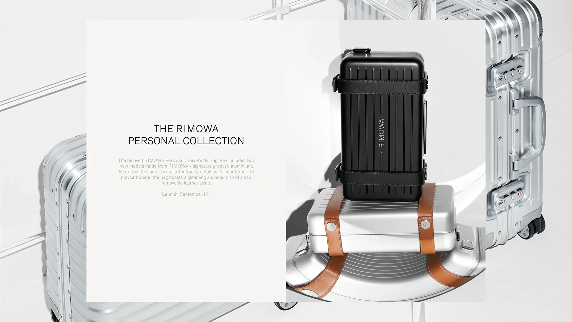
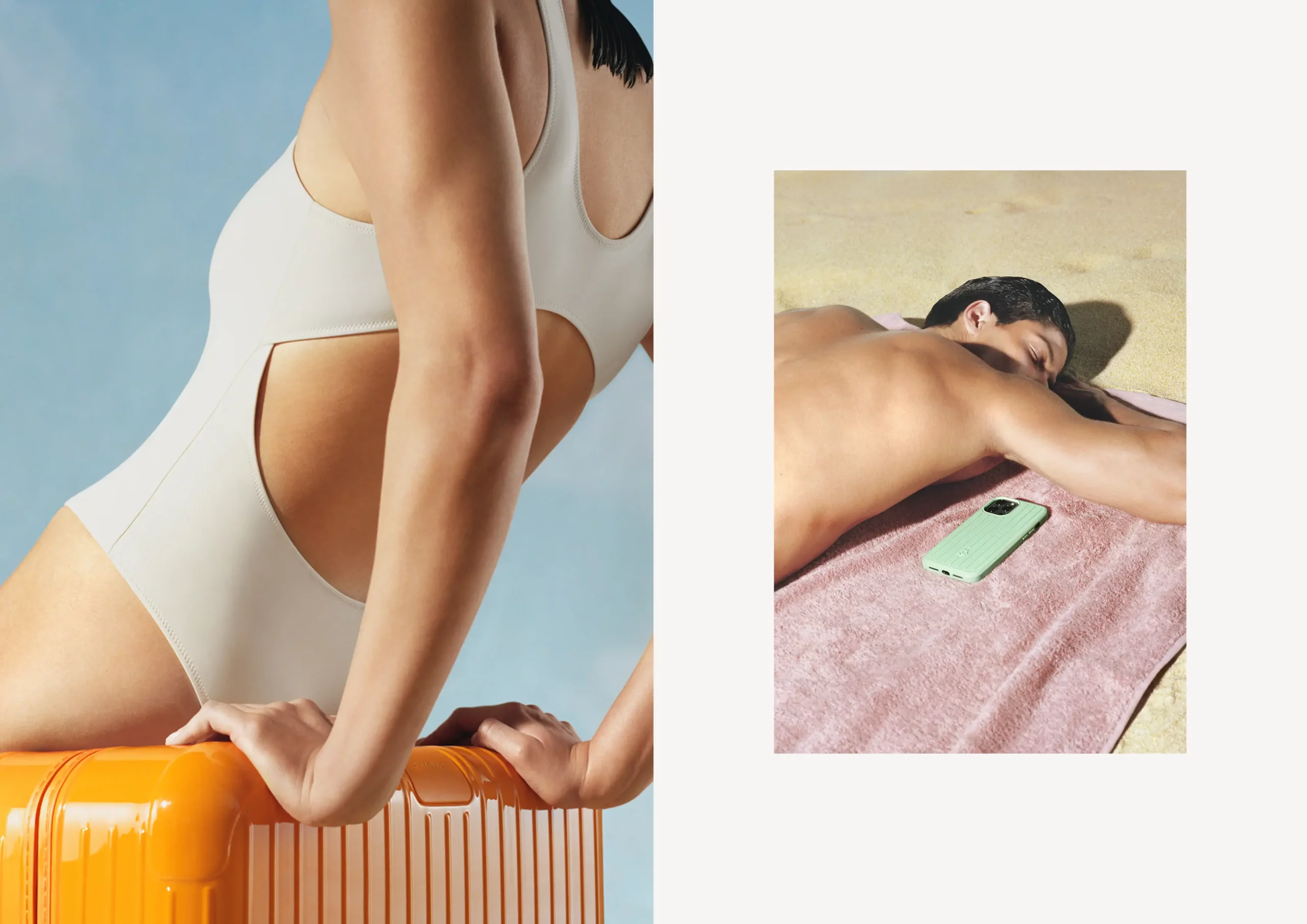
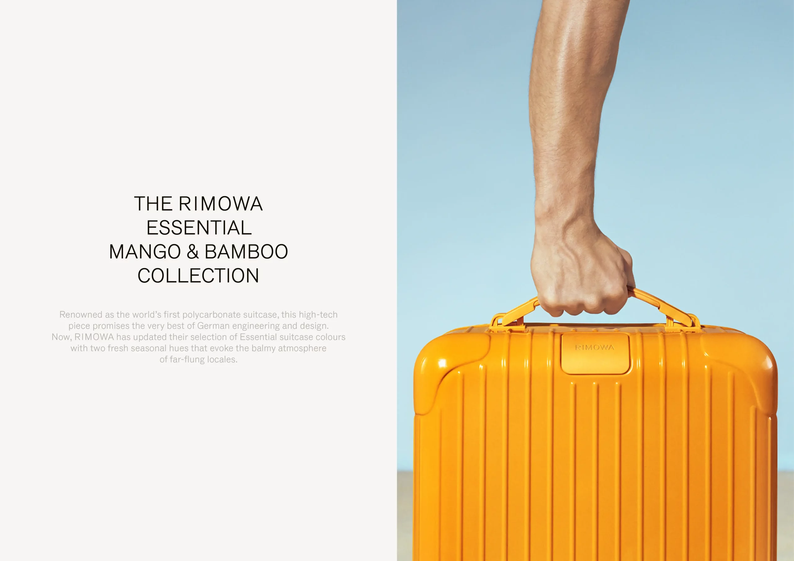
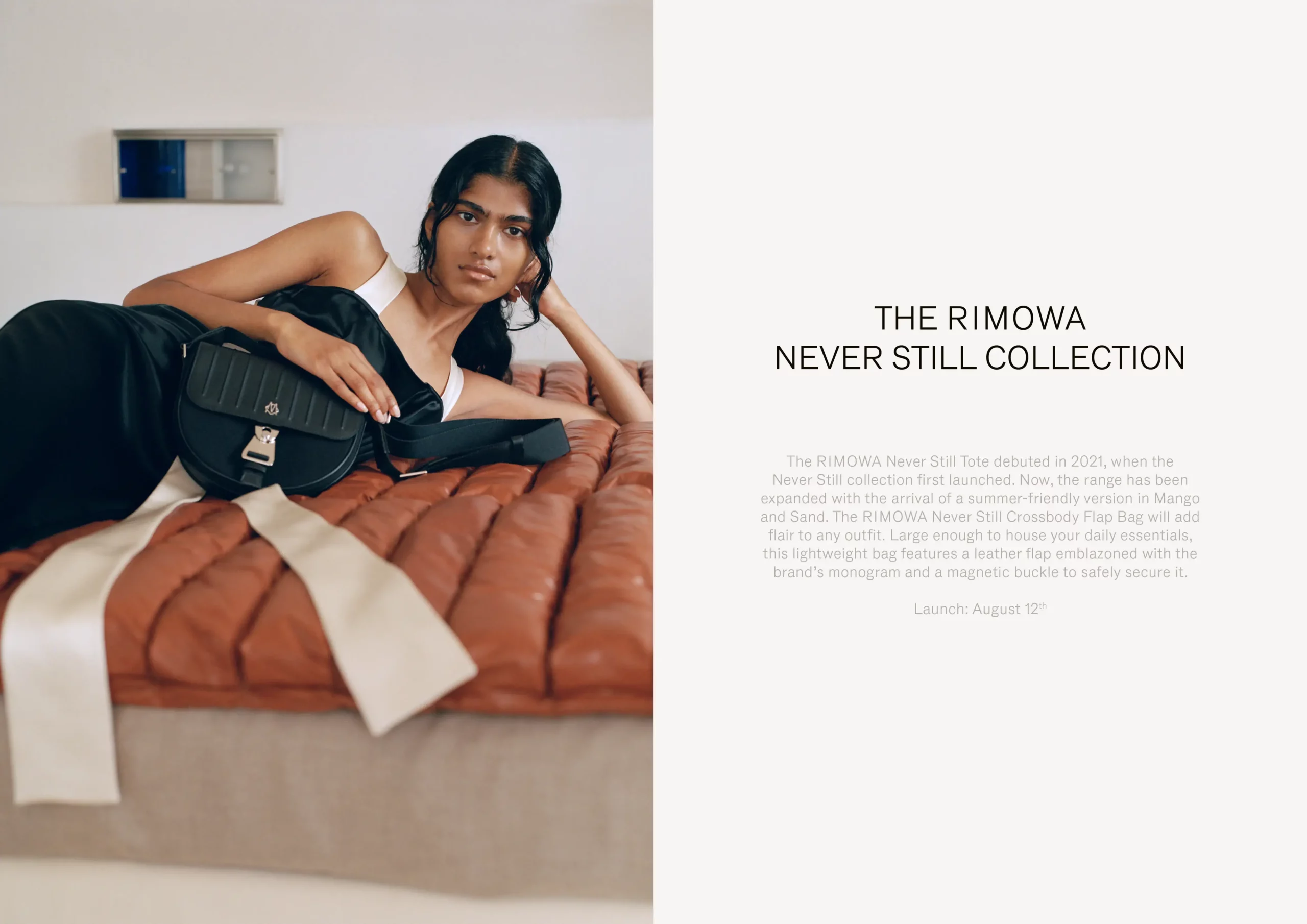
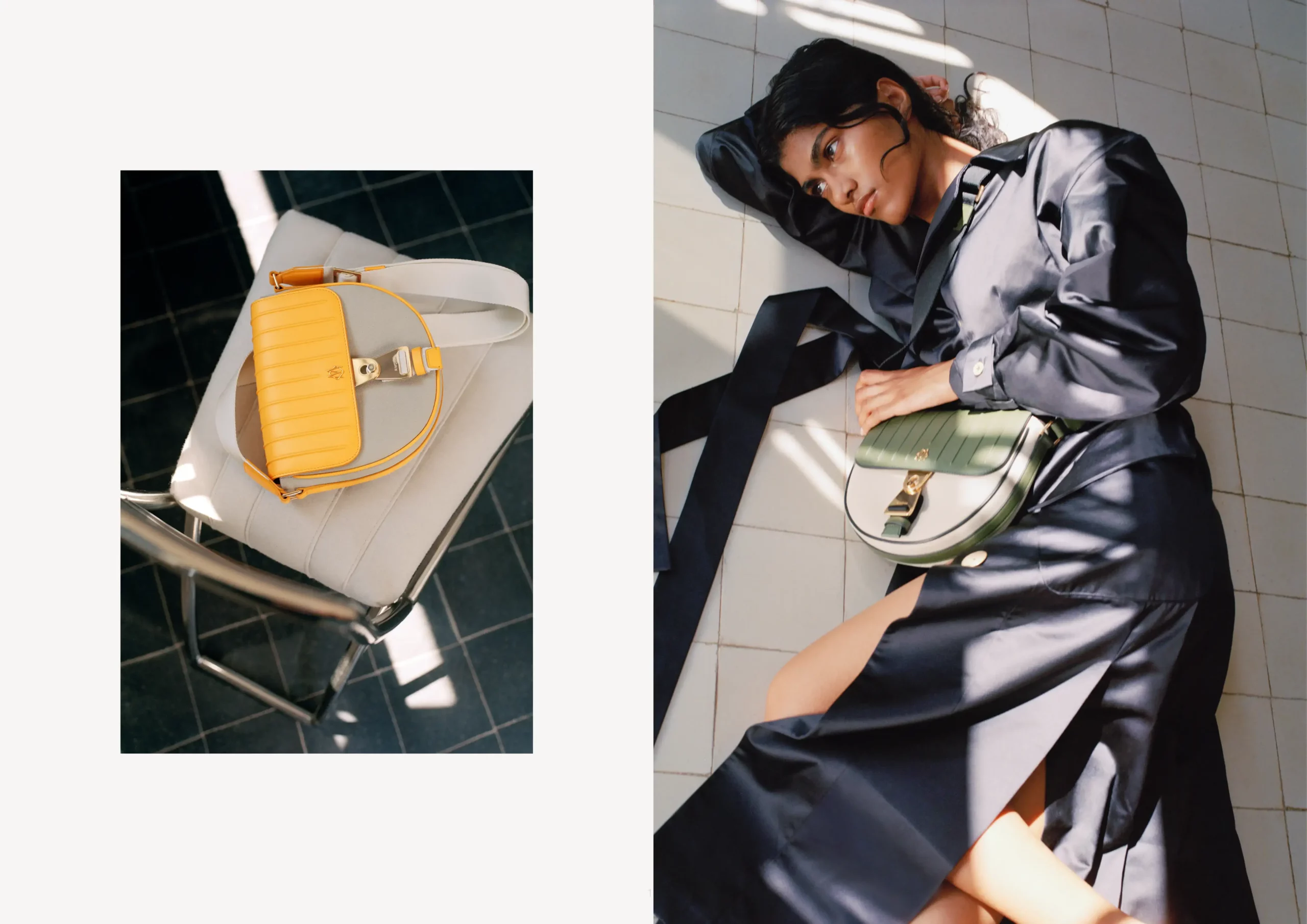
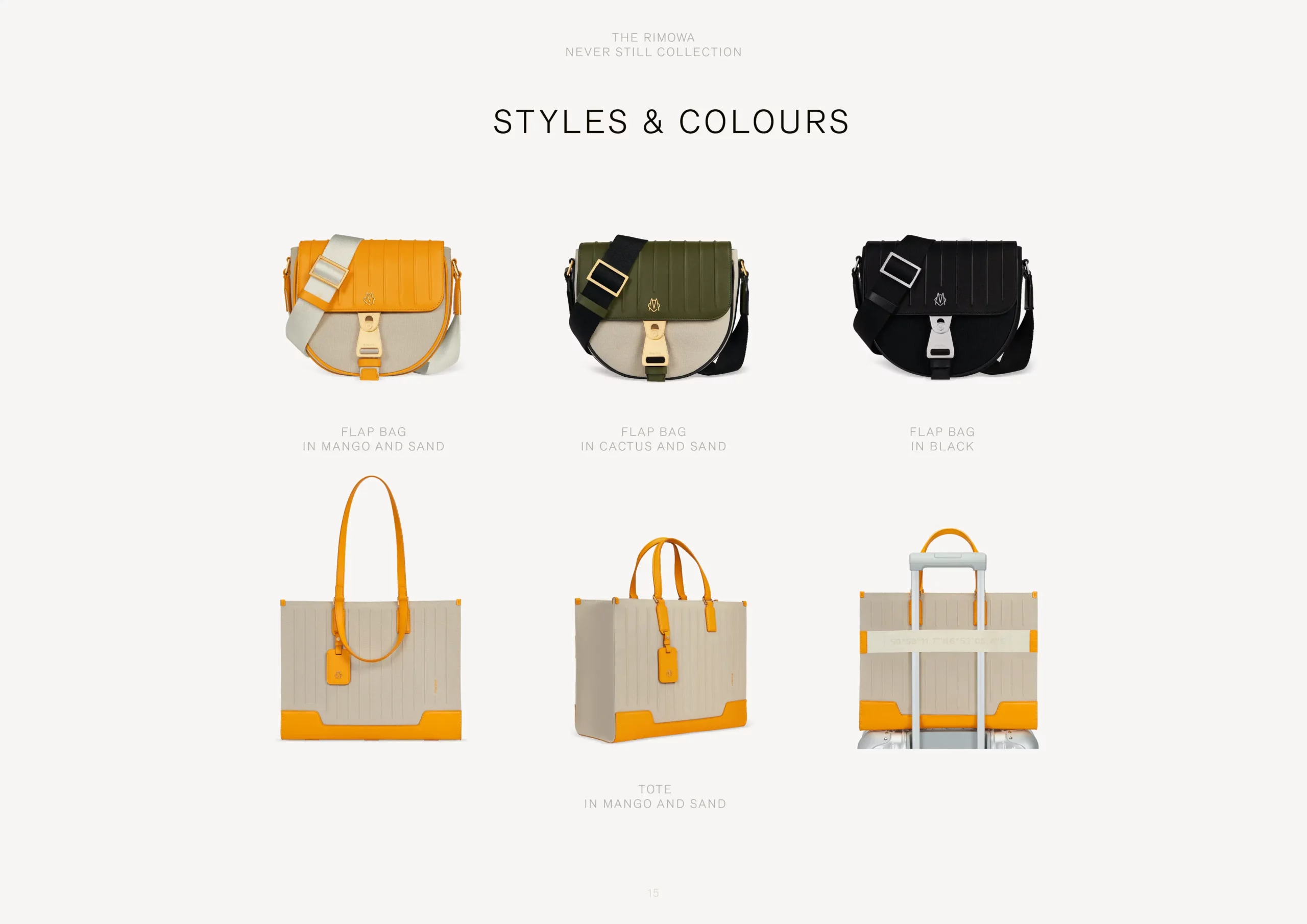
Digital Summer Lookbook for RIMOWA
Introducing this season’s curated collection of suitcases, bags and accessories in new seasonal hues as well as timeless classics.
Graphic Design, 2021
(With Faustine BC de Longueil)
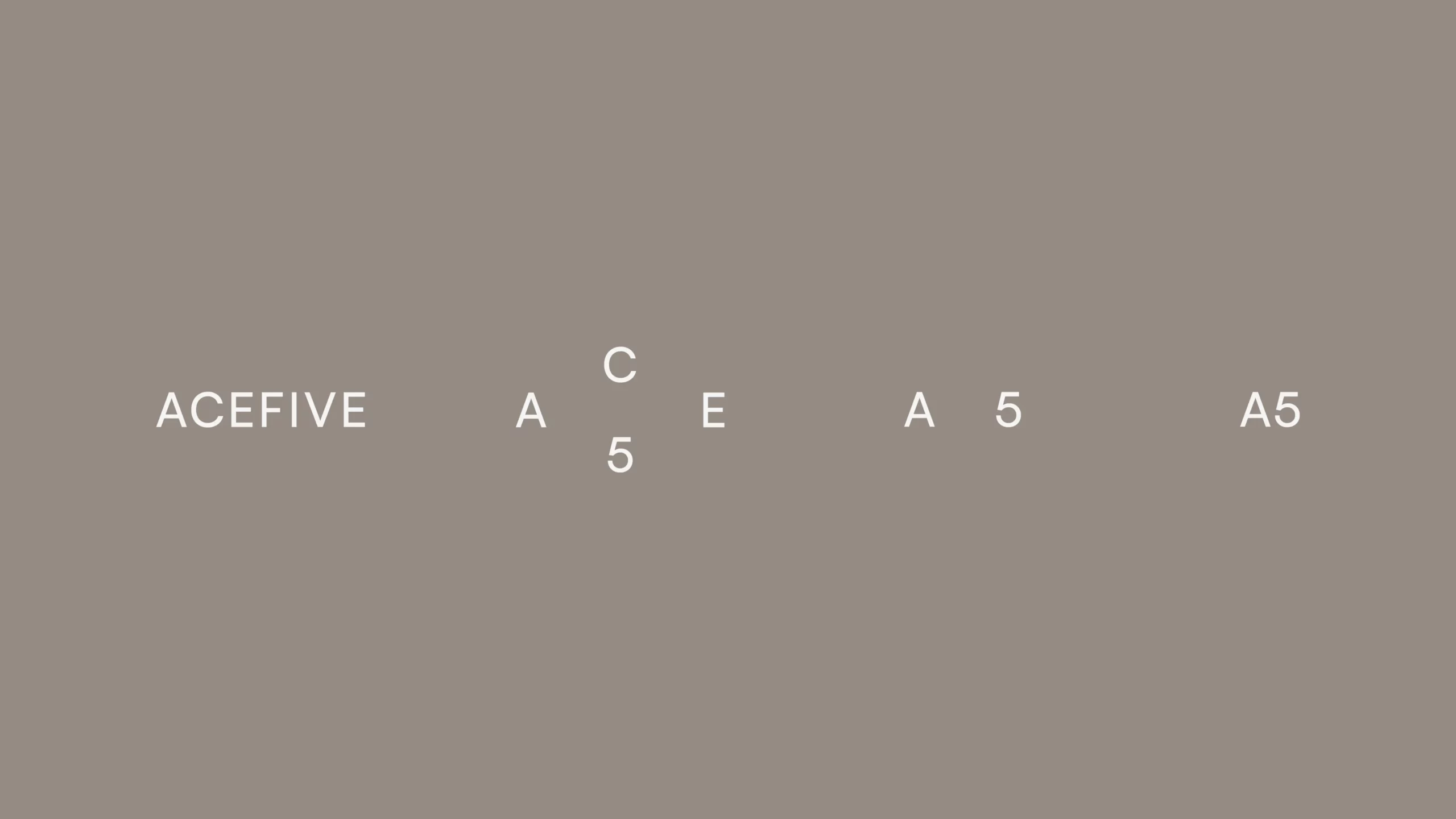
Corporate Identity for Acefive
Logotype and Typography for the innovative dog care brand.
Visual Identity & Webshop, 2021
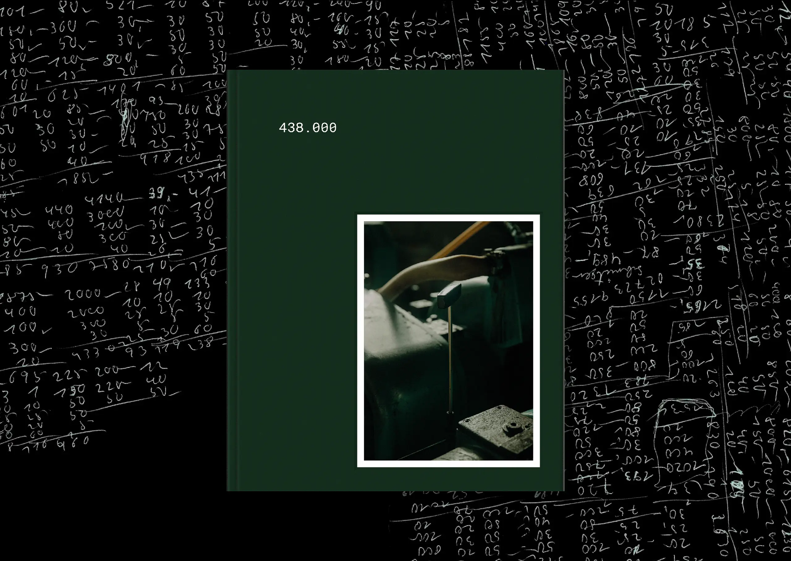
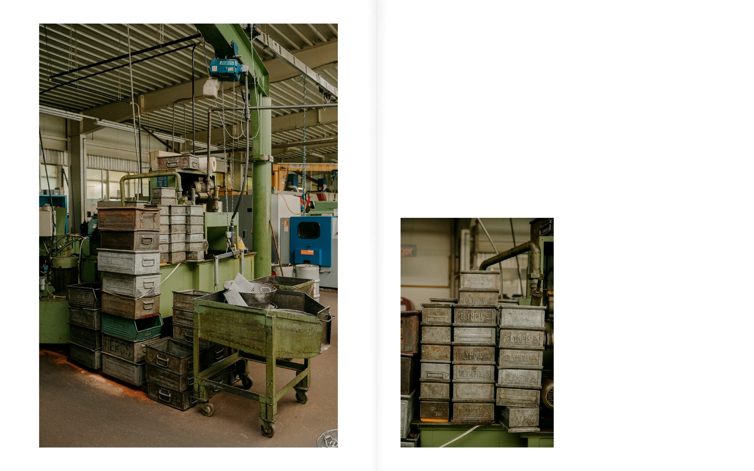
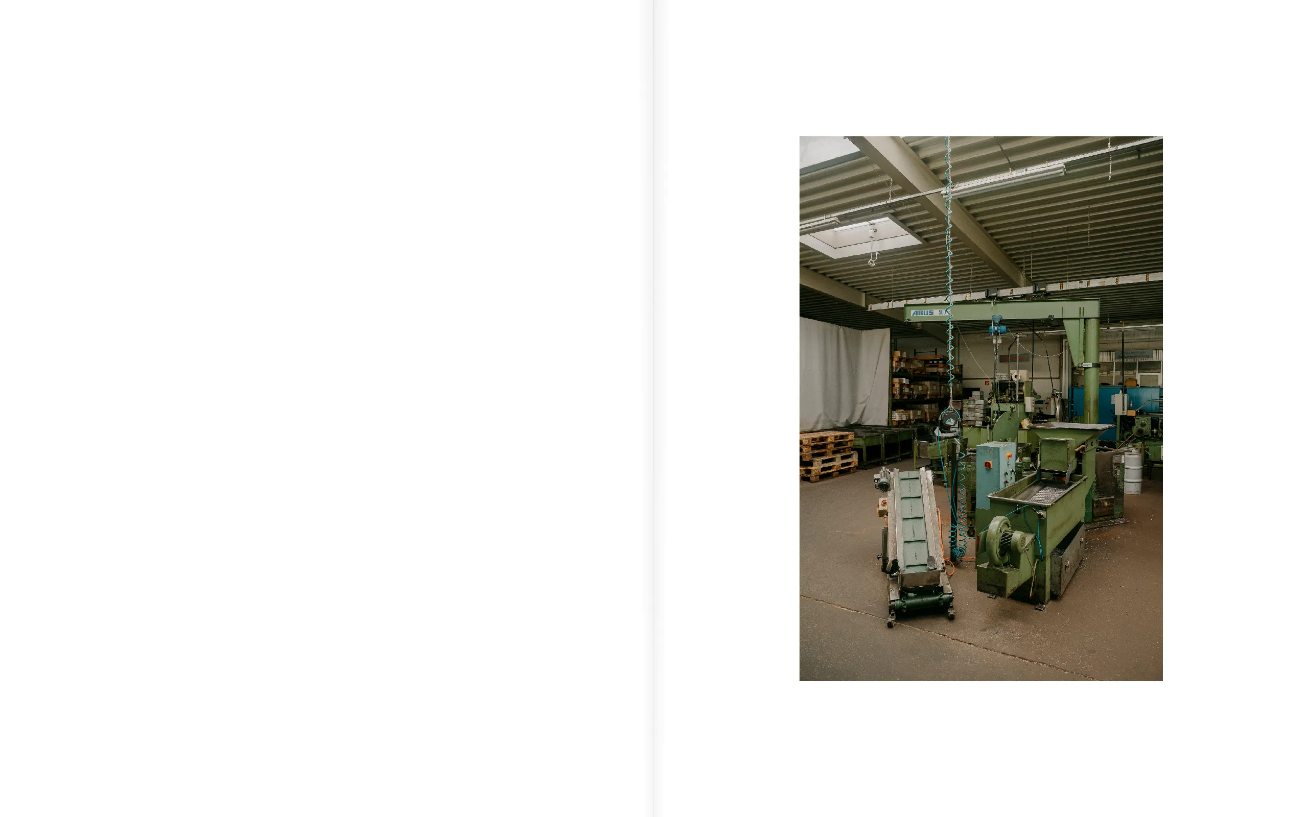
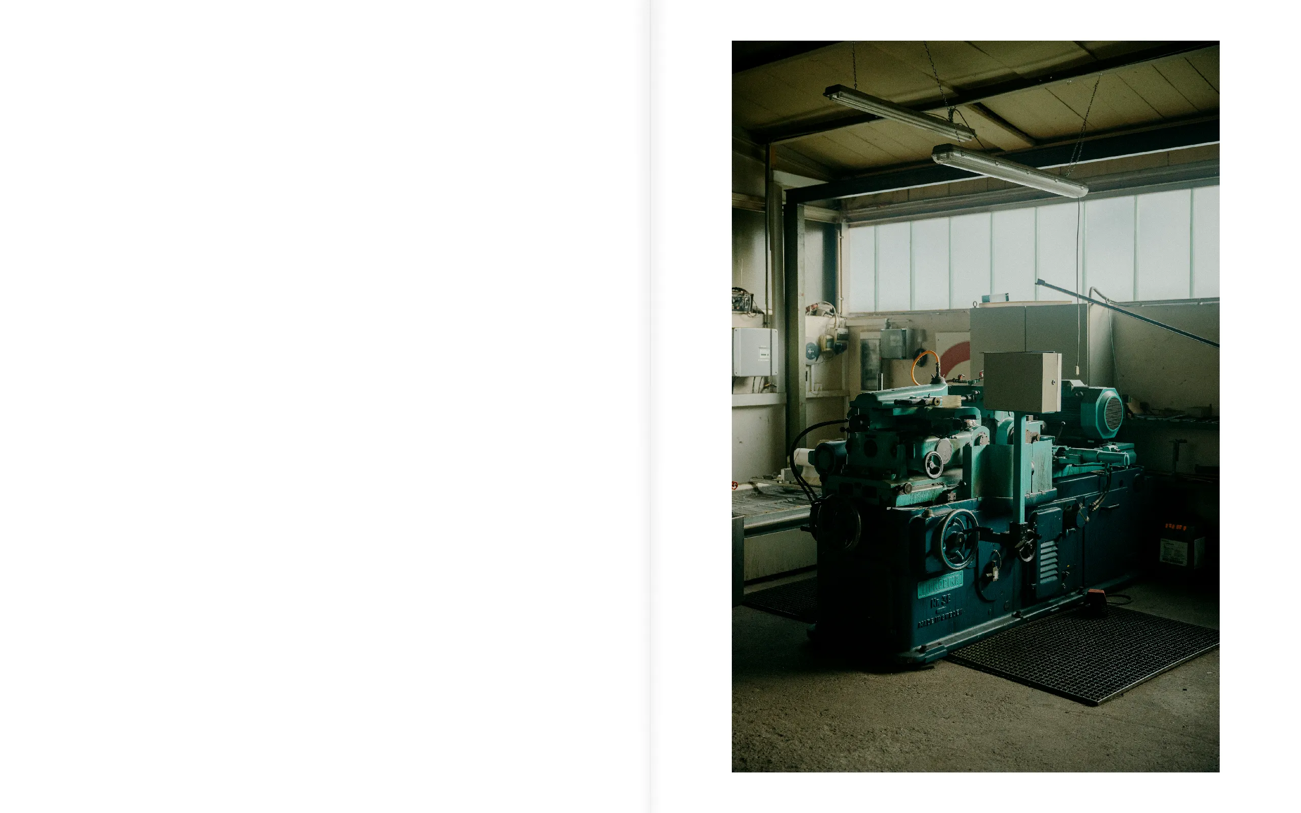
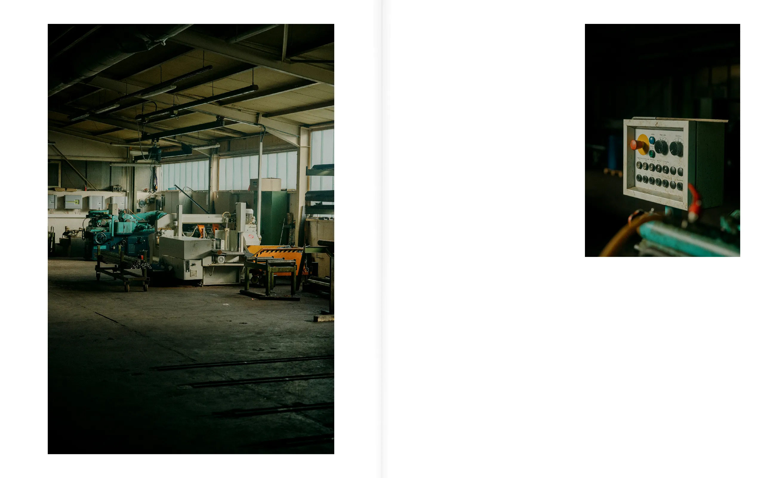
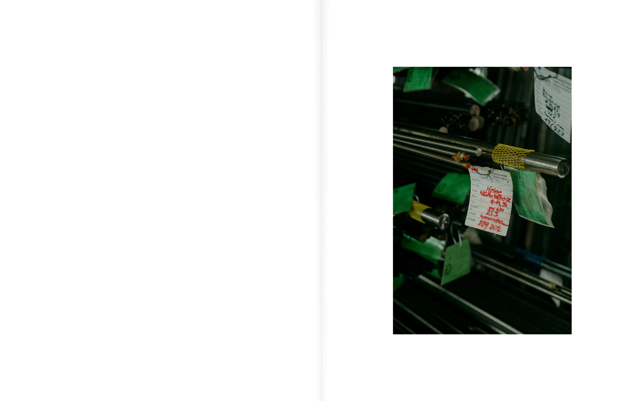
Book Edition for P. Keine
Documenting a turning point for the family-owned manufacturing company in Sauerland, Germany.
Editorial Design, 2021
Photography: Felix von der Osten & Kayla Kauffman
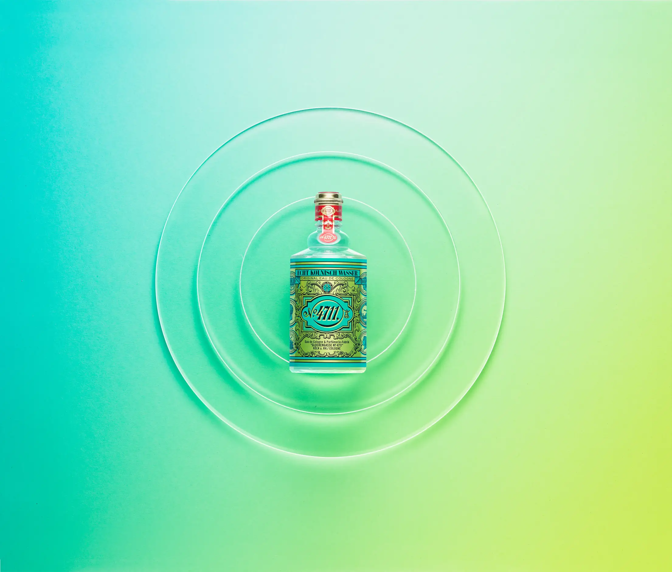
Key-Visual for 4711 – Original Eau de Cologne
Summer-themed key visual as part of refreshing the brand assets of the historic Cologne-based fragrance brand 4711.
Visual Concept & Set Design, 2017
Agency: Caution, Creative Direction: Ralf Liess
Photography: Manuel Mittelpunkt
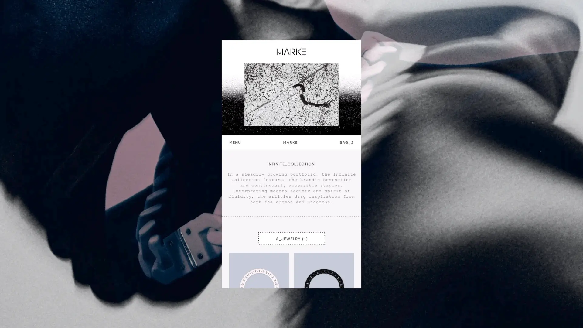
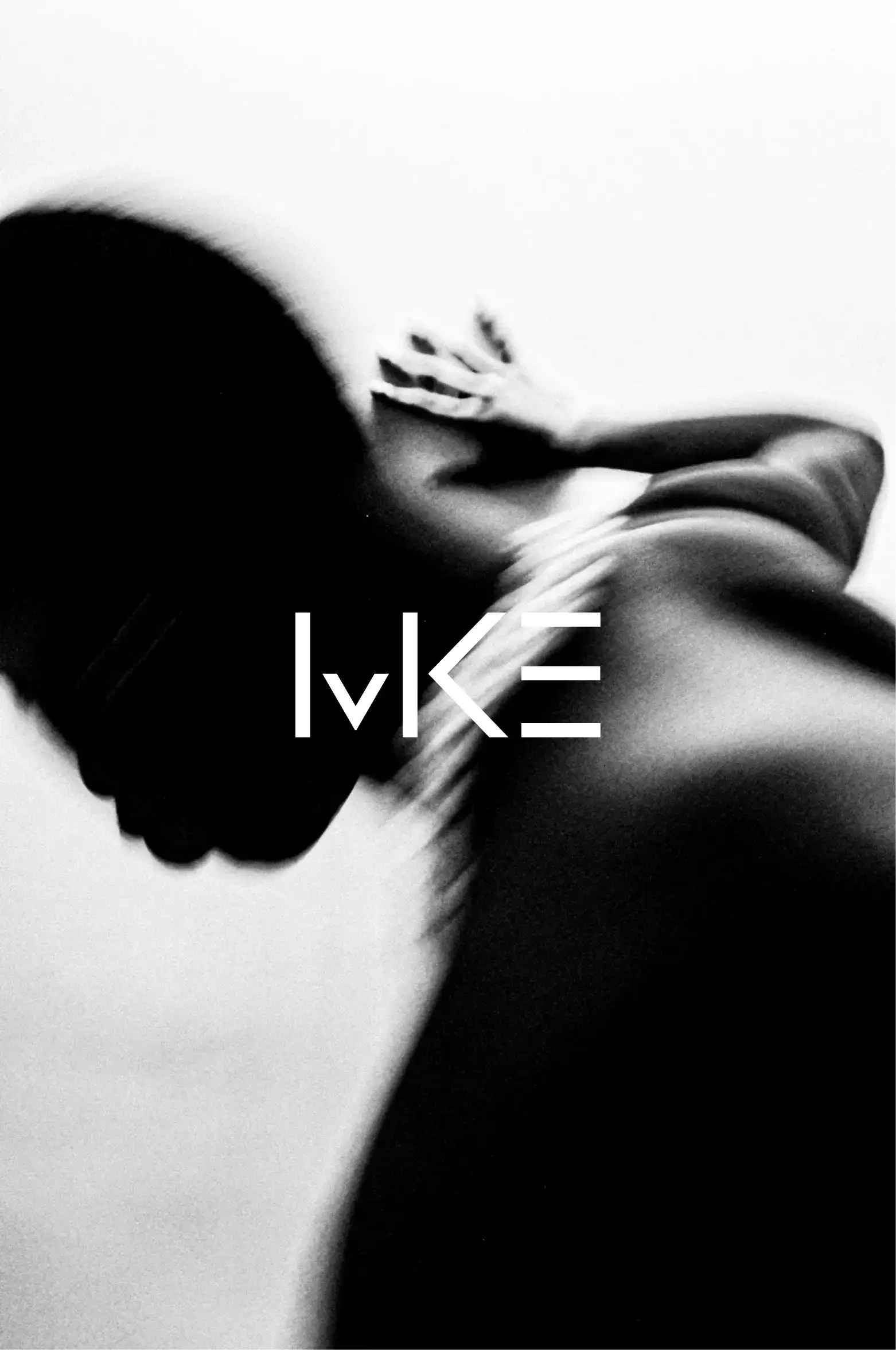
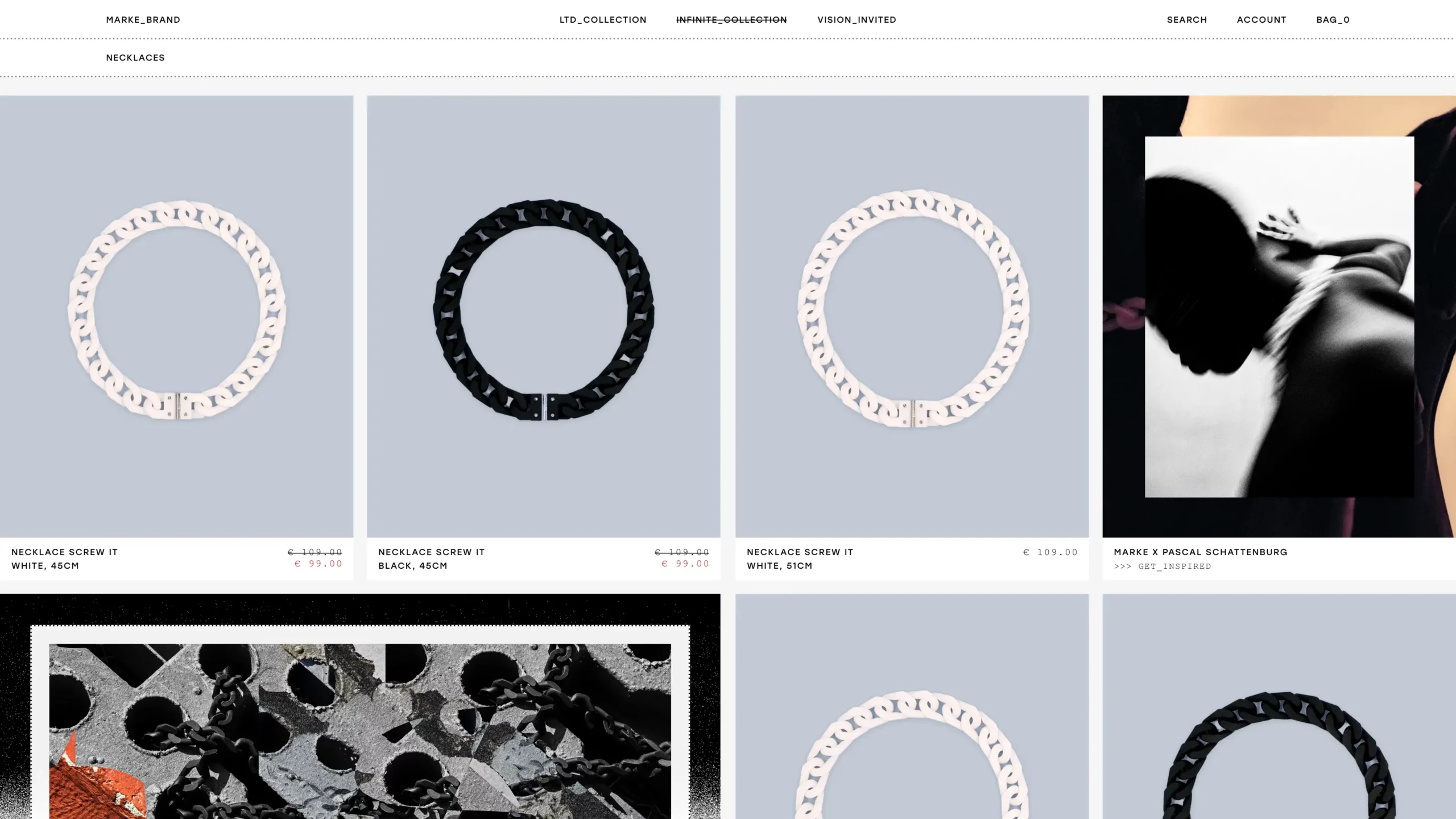
Visual Identity for Marke
Visual Identity and Web Design for the up and coming fashion brand Marke; presenting Marke’s versatile and expressive collection in a brutalist way, leaving room for the brand’s creativity.
Visual Identity & Webshop, 2021
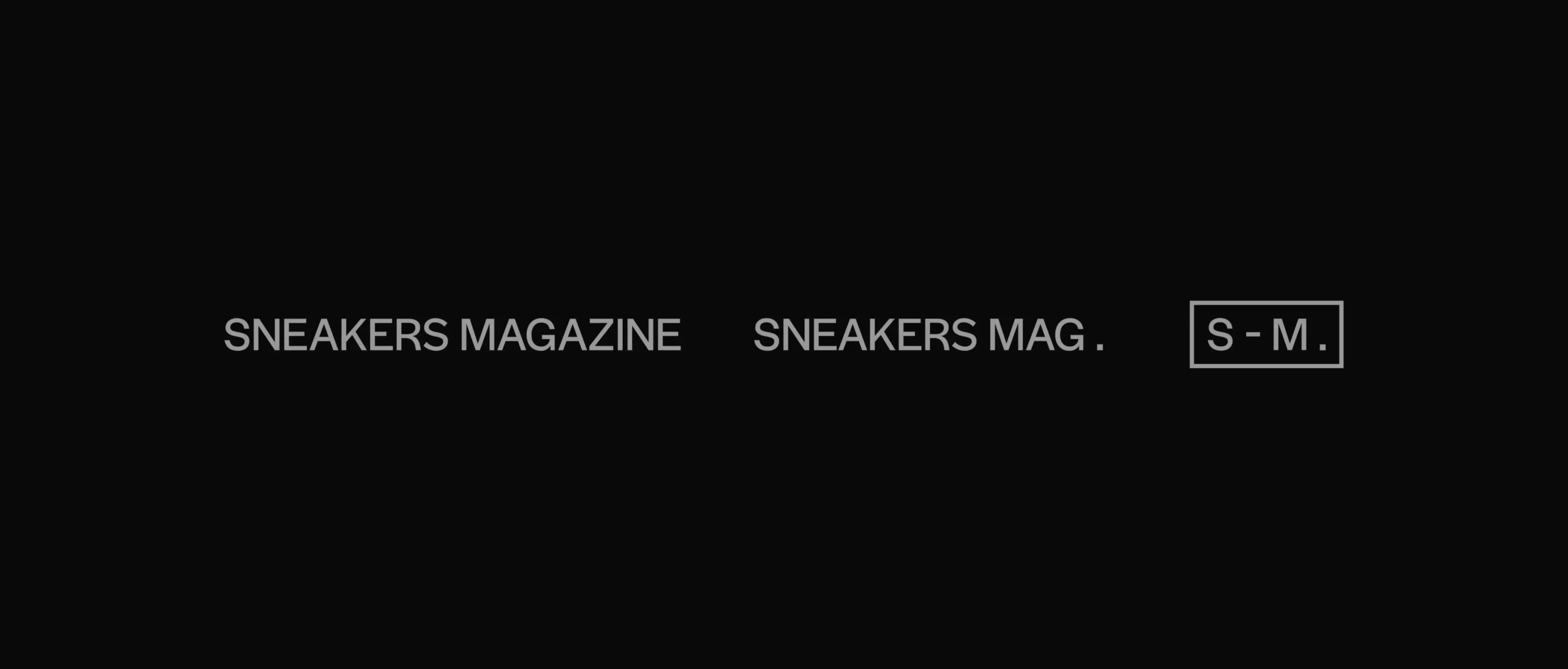
Logotype for Sneakers Magazine
Logo redesign for Sneakers Magazine as part of their digital relaunch. The logo features a geometric sans serif font with alternate glyphs as a reference to their former identity as well as the broader theme of hype culture.
Logodesign, 2019
Discover More
Matthias' creative practice is based on an integrated approach that flexibly combines creative disciplines, methods and ideas. There is no prescribed approach, as each project requires a different iterative process to come to life and successfully fulfill its purpose. Grounded in research and informed by current cultural phenomena, Matthias brings together intuitive ideas and experimentation in a strategic way, working collaboratively to develop creative concepts and implement them in a highly aesthetic manner. His practice ultimately translates into commercial brand identities, publications, digital interfaces, marketing and service strategies, as well as artistic research projects.